Brooklittles
Brand Strategy Naming Identity Design Creative Direction Art Direction
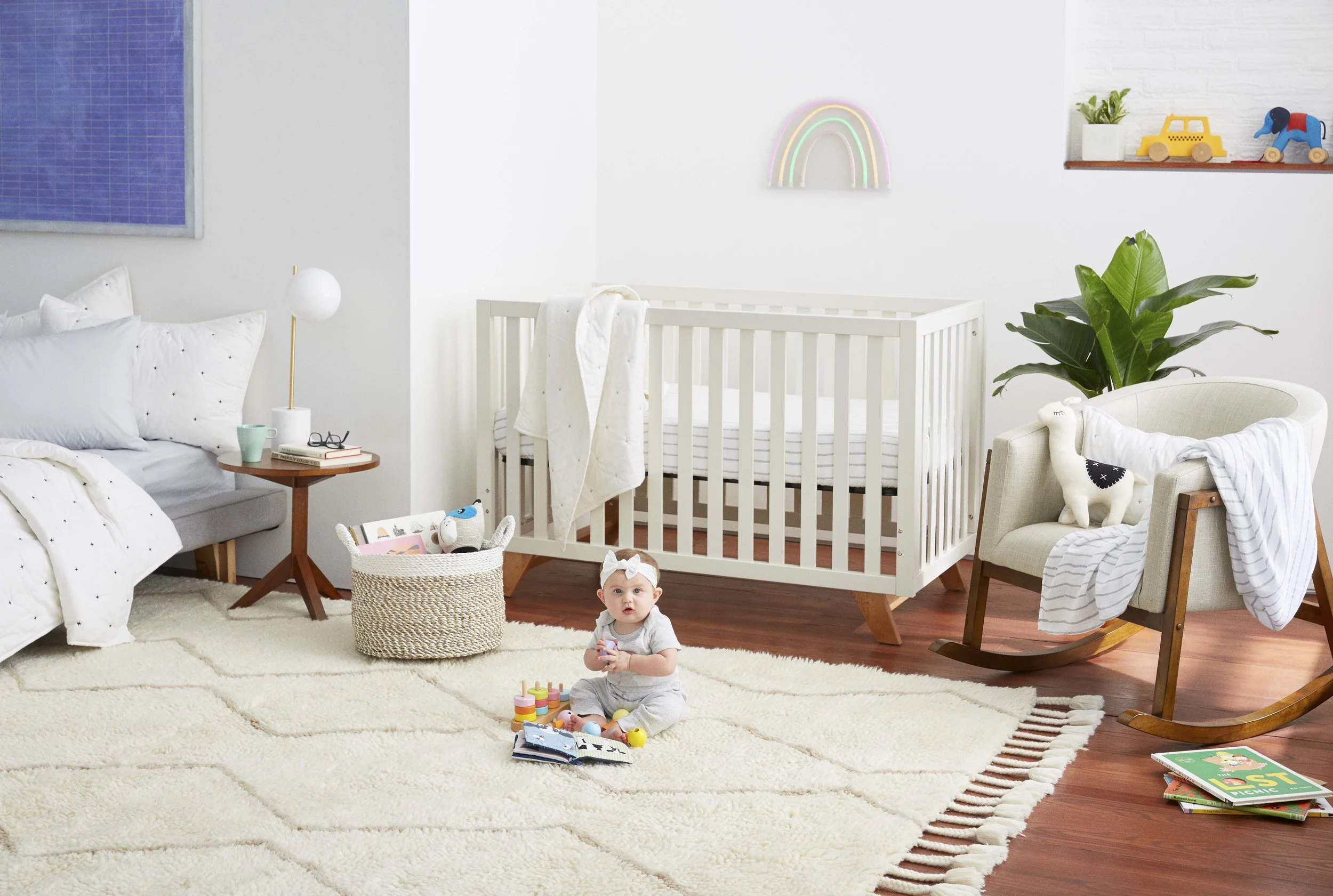
Brooklinen – beloved by grown ups –, launched a line of baby and kids bedding and bath products. Because you’re never too young for the good stuff.


Brand Strategy Naming Identity Design Creative Direction Art Direction